COLOR PSYCHOLOGY
July 12, 2023
Colors have a profound impact on our emotions and perceptions, and this influence is especially significant in the world of design. Whether you're creating a website, designing a logo, or choosing the color scheme for your home, understanding color psychology can help you achieve your desired effect. In this blog post, we'll explore the fascinating world of color psychology and its applications in design.
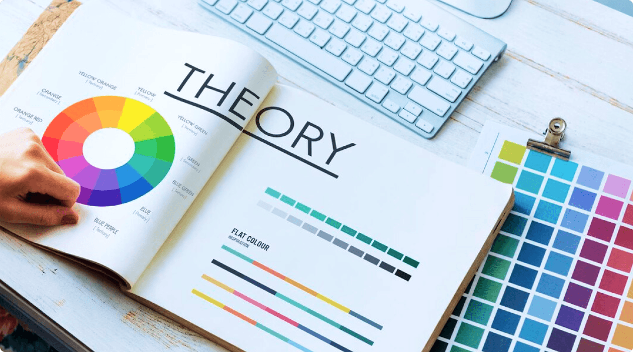
Color psychology is the study of how different colors can affect our moods, emotions, and behaviors. It's a complex field that examines the psychological, cultural, and even physiological aspects of color. While the effects of colors can vary from person to person due to individual experiences and cultural backgrounds, there are some general principles that designers can use to their advantage.The Basics of Color Associations.
Color psychology is a powerful tool that designers can use to create compelling and emotionally resonant experiences. By understanding the psychological impact of colors and strategically incorporating them into your designs, you can better connect with your audience, convey your brand's message, and elicit the desired emotional responses. So, the next time you embark on a design project, consider the psychology behind the colors you choose, and watch how it transforms the impact of your work.
Red: Red is often associated with passion, excitement, and energy. It can also evoke feelings of love and warmth. In design, it's frequently used to grab attention and create a sense of urgency.
Blue: Blue is linked to calmness, trust, and reliability. It's commonly used in corporate branding to convey professionalism and dependability.
Green: Green is associated with nature, growth, and freshness. It can create a sense of balance and harmony, making it popular in Eco-friendly and health-related designs.
Yellow: Yellow is associated with happiness, optimism, and creativity. It's often used to capture attention and convey a sense of playfulness.
Purple: Purple is often linked to luxury, sophistication, and spirituality. It can create a sense of elegance and mystery.
Black: Black is associated with power, elegance, and authority. It's often used to convey a sense of sophistication and timelessness.
White: White represents purity, simplicity, and cleanliness. It's commonly used in minimalist designs and healthcare-related materials.
Brand Identity: When choosing colors for a brand, consider the emotions and associations you want to convey. For example, a health and wellness brand might use calming greens and blues, while a tech company aiming for innovation and excitement might opt for vibrant reds and yellows.
Web Design: Your website's color scheme can greatly impact user experience. Use colors strategically to guide visitors' emotions and actions. For instance, use contrasting colors for call-to-action buttons to draw attention.
Product Packaging: The colors used on product packaging can influence purchasing decisions. Consider the emotions and associations you want customers to associate with your product when choosing packaging colors.
Interior Design: In home and interior design, color can affect the atmosphere of a space. Cool colors like blues and greens can create a calming environment, while warm colors like reds and yellows can add energy and vibrancy.
Color Associations: Colors are often associated with specific emotions, meanings, and cultural references. For example, red is commonly associated with passion, energy, and excitement, while blue is often associated with calmness, trust, and reliability. Designers can use these associations to communicate certain messages or create specific atmospheres.
User Experience: Colors can significantly impact the user experience of a website, application, or product. The right color choices can enhance usability, draw attention to important elements, and create a pleasant and engaging experience for users. However, it's essential to consider accessibility and ensure that color choices accommodate users with visual impairments.
Call-to-Action (CTA): Colors can influence user behavior, especially when it comes to CTA's. For example, using a contrasting color for a CTA button can make it stand out and increase the likelihood of users clicking on it. Red and orange are often used for urgent or attention-grabbing CTA's, while green or blue can convey a sense of trust and action.
Cultural Considerations: Colors can have different meanings and associations across different cultures. Designers should be mindful of cultural contexts and avoid using colors that may be offensive or have negative connotations in certain cultures. Conducting research or consulting with local experts can help ensure that color choices are culturally appropriate.
Remember that color psychology is not an exact science, and individual preferences and cultural factors can influence how people perceive and respond to colors. It's essential to consider color psychology as one tool among many in the design process and to test and iterate based on user feedback and data.